Data Visualization in R | A Beginner’s Guide
Data visualization is a crucial aspect of data analysis and interpretation, allowing us to see patterns, trends, and insights that might not be apparent from raw data alone. R, a powerful statistical programming language, provides a vast array of tools and libraries to create a wide range of visualizations.
In this article, we will explore various data visualization techniques in R, including boxplots, histograms, pie charts, and more, with code examples.
Is R Good for Data Visualization?
R is renowned for its statistical prowess and rich ecosystem of packages tailored for data analysis and visualization. Here are some reasons why R is a go-to choice for data visualization:
- Diverse Visualization Packages: R provides numerous packages that cater to different types of visualizations, from simple plots to interactive dashboards.
- Customizability: R allows extensive customization of plots, enabling users to fine-tune their visuals to convey the intended message effectively.
- Integration with Statistical Analysis: R seamlessly integrates visualization with statistical analysis, making it easier to explore data and perform complex analyses.
- Community Support: R boasts a large, active community that continually develops and maintains packages, ensuring that users have access to cutting-edge tools and resources.
How to Visualize Data in R?
Before diving into specific plots, ensure you have R installed on your system. Additionally, we’ll be using some popular R libraries for visualization, such as ggplot2, lattice, and base R plotting functions.
# Install necessary packages
install.packages("ggplot2")
install.packages("lattice")
install.packages("dplyr")  # For data manipulation
Loading Libraries:
# Load libraries
library(ggplot2)
library(lattice)
library(dplyr)
With that out of the way, let’s get started with data visualization in R.
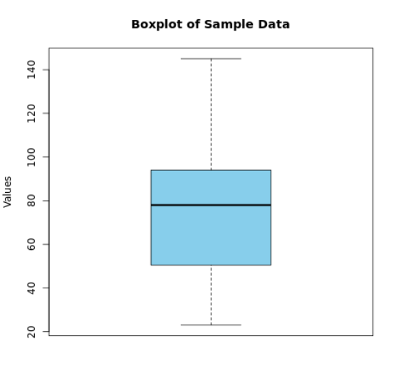
Boxplots
Boxplots are useful for visualizing the distribution of a dataset and identifying outliers. They display the median, quartiles, and extreme values at a glance.
# Sample data
data <- c(23, 45, 56, 67, 89, 123, 45, 78, 88, 99, 145)
# Creating a boxplot
boxplot(data, main="Boxplot of Sample Data", ylab="Values", col="skyblue")
Output:
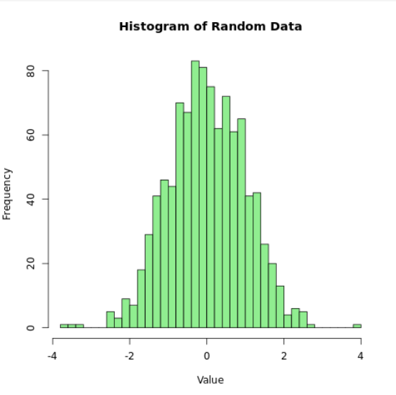
Histograms
Histograms show the distribution of a dataset by dividing the data into bins of equal width.
# Sample data
data <- rnorm(1000)
# Creating a histogram
hist(data, breaks=30, col="lightgreen", main="Histogram of Random Data", xlab="Value", ylab="Frequency")
Output:
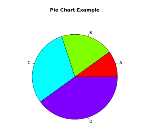
Pie Charts
Pie charts are used to display the proportions of a whole. While they are less precise than other types of plots, they can be useful for simple datasets.
# Sample data
slices <- c(10, 20, 30, 40)
labels <- c("A", "B", "C", "D")
# Creating a pie chart
pie(slices, labels = labels, col=rainbow(length(slices)), main="Pie Chart Example")
Output:
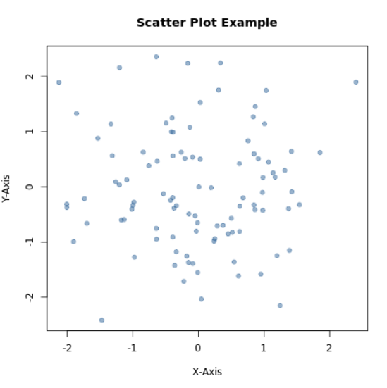
Scatter Plots
Scatter plots are used to visualize the relationship between two variables, often revealing correlations or trends.
# Sample data
x <- rnorm(100)
y <- rnorm(100)
# Creating a scatter plot
plot(x, y, main="Scatter Plot Example", xlab="X-Axis", ylab="Y-Axis", pch=19, col=rgb(0.2,0.4,0.6,0.5))
Output:
Line Plots
Line plots are useful for visualizing trends over time or ordered data points.
# Sample data
x <- 1:10
y <- c(2, 3, 5, 7, 11, 13, 17, 19, 23, 29)
# Creating a line plot
plot(x, y, type="o", col="blue", main="Line Plot Example", xlab="Index", ylab="Prime Numbers")
Output:

Bar Plots
Bar plots are ideal for comparing quantities across different groups.
# Sample data
counts <- c(5, 10, 15, 20)
names <- c("Group 1", "Group 2", "Group 3", "Group 4")
# Creating a bar plot
barplot(counts, names.arg=names, col="grey", main="Bar Plot Example", ylab="Counts")
Output:

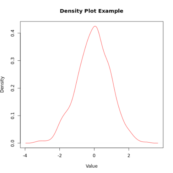
Density Plots
Density plots are useful for visualizing the distribution of a continuous variable.
# Sample data
data <- rnorm(1000)
# Creating a density plot
plot(density(data), main="Density Plot Example", xlab="Value", ylab="Density", col="red")
Output:
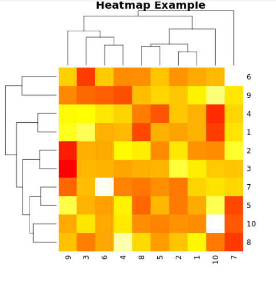
Heatmaps
Heatmaps are great for visualizing data matrices or showing the intensity of a variable.
# Sample data
data <- matrix(rnorm(100), nrow=10)
# Creating a heatmap
heatmap(data, main="Heatmap Example", col=heat.colors(256))
Output:
Which Package is Used for Data Visualization in R?
Several packages in R are widely used for data visualization, each offering unique features and capabilities. Here are some of the most popular ones:
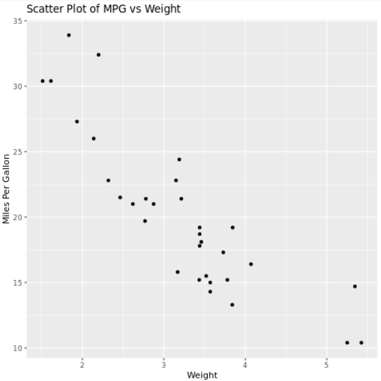
ggplot2
ggplot2 is arguably the most popular visualization package in R. It is based on the Grammar of Graphics, which allows users to create complex visualizations by layering components.
Features:
- Layered approach to build plots
- High customization capabilities
- Supports a variety of plot types (e.g., bar plots, scatter plots, histograms)
- Extensible through additional packages like ggthemes and ggplotly
Example:
# Install and load ggplot2
if (!requireNamespace("ggplot2", quietly = TRUE)) {
  install.packages("ggplot2")
}
library(ggplot2)
# Create a simple scatter plot
data(mtcars)
ggplot(mtcars, aes(x = wt, y = mpg)) +
  geom_point() +
  labs(title = "Scatter Plot of MPG vs Weight",
       x = "Weight",
       y = "Miles Per Gallon")
Output:
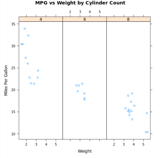
Lattice
Lattice is another powerful visualization package in R, offering a multi-panel conditioning system that is particularly useful for visualizing complex multivariate data.
Features:
- Trellis graphics for visualizing relationships in data
- Suitable for creating conditioning plots
- Good for plotting categorical data
Example:
# Install and load lattice
if (!requireNamespace("lattice", quietly = TRUE)) {
  install.packages("lattice")
}
library(lattice)
# Create a conditioning plot
xyplot(mpg ~ wt | factor(cyl), data = mtcars, layout = c(3, 1),
       main = "MPG vs Weight by Cylinder Count",
       xlab = "Weight",
       ylab = "Miles Per Gallon")
Output:
plotly
plotly is a library that brings interactivity to R visualizations. It is built on top of ggplot2 and provides tools to create interactive web-based visualizations.
Features:
- Interactive plots with zoom, pan, and hover capabilities
- Integrates with ggplot2 for enhanced visuals
- Supports a wide range of plot types
Example:
# Install and load plotly
if (!requireNamespace("plotly", quietly = TRUE)) {
  install.packages("plotly")
}

library(plotly)
# Create an interactive plot
p <- ggplot(mtcars, aes(x = wt, y = mpg)) +
  geom_point()
ggplotly(p)
highcharter
highcharter is an R wrapper for the popular JavaScript charting library Highcharts. It is well-suited for creating interactive and visually appealing plots.
Features:
- High-quality interactive visualizations
- Extensive chart options, including time series, stock charts, and more
- Easy customization and theming
Example:
# Install and load highcharter
if (!requireNamespace("highcharter", quietly = TRUE)) {
  install.packages("highcharter")
}

library(highcharter)
# Create a basic highchart
hchart(mtcars, "scatter", hcaes(x = wt, y = mpg, group = factor(cyl))) %>%
  hc_title(text = "Miles Per Gallon vs Weight")
shiny
shiny is a framework for building interactive web applications directly from R. It allows you to create data dashboards and interactive data visualizations easily.
Features:
- Build interactive web applications
- Reactive programming model
- Integrates with other R packages for data manipulation and visualization
Example:
# Install shiny
if (!requireNamespace("shiny", quietly = TRUE)) {
  install.packages("shiny")
}
# Load shiny and create a simple app
library(shiny)
ui <- fluidPage(
  titlePanel("Interactive MPG vs Weight Plot"),
  sidebarLayout(
    sidebarPanel(
      sliderInput("cyl", "Number of Cylinders:",
                  min = 4, max = 8, value = 4, step = 2)
    ),
    mainPanel(
      plotOutput("scatterPlot")
    )
  )
)
server <- function(input, output) {
  output$scatterPlot <- renderPlot({
    ggplot(subset(mtcars, cyl == input$cyl), aes(x = wt, y = mpg)) +
      geom_point() +
      labs(title = paste("MPG vs Weight for", input$cyl, "Cylinders"),
           x = "Weight",
           y = "Miles Per Gallon")
  })
}
shinyApp(ui = ui, server = server)
Frequently Asked Questions
Which library is used for visualization in R?
Plotly is a versatile, open-source R package that empowers users to craft visually appealing and dynamic graphics. Its capabilities extend to creating interactive visualizations that offer engaging data exploration.
Which is better for visualization R or Python?
R has a strong reputation for data visualization. Originally designed for statistical analysis, its core graphics module provides a solid foundation for creating basic charts and plots. Packages like ggplot2 offer even greater flexibility, enabling the construction of intricate visualizations such as scatter plots with regression lines.
Conclusion
R provides a rich set of tools for data visualization, enabling you to create a variety of plots to suit your analytical needs. Whether using base R functions or the more advanced ggplot2 package, R allows for customization and precision in creating compelling visualizations. Experiment with these examples to enhance your data analysis and storytelling capabilities. Happy visualizing!